How Fixing Live Activities Accidentally Became a Feature
When I shipped version 3.0 back in September, it was mostly about fixing the mess the app had become visually.
The app had grown organically over the past year and a half. What started as a handful of watch complications slowly morphed into notifications, widgets, Live Activities, a dashboard—all these pieces bolted on as I learned what users wanted. But there was no design structure. Everything felt cluttered, like features were competing for space rather than fitting together.
iOS 26's new design language gave me the excuse I needed. It felt like the right moment to step back and reorganize everything—give each feature its proper place, make the app feel cohesive instead of cobbled together. If I might say, I think it turned out pretty well. Yugi helped a lot with this, which I'll get to later.
But once 3.0 was out and the app finally looked and felt structured, something else became obvious: there was still a lot of stability work to do underneath. The app works great on my setup, but I kept hearing from users with different experiences. Different iPhone models, different Apple Watch generations, different iOS versions. Thousands of possible combinations, and I only have one of each. When two devices need to talk to each other through Apple's background refresh limitations, things can go wrong in ways I can't always reproduce.
So after 3.0, I committed to stability. No new features until the foundation was solid. I started with complications, then notifications, working through them one piece at a time.
Which eventually brought me back to Live Activities.
The Promise and Reality of Live Activities
Live Activities felt like such a promising feature when Apple announced them. With iOS 18, they extended to Apple Watch, which seemed perfect—another way to show your iPhone's battery level right on your wrist. I implemented them, shipped them, and then started getting the feedback I expected but hoped wouldn't come.
"It's not actually live."
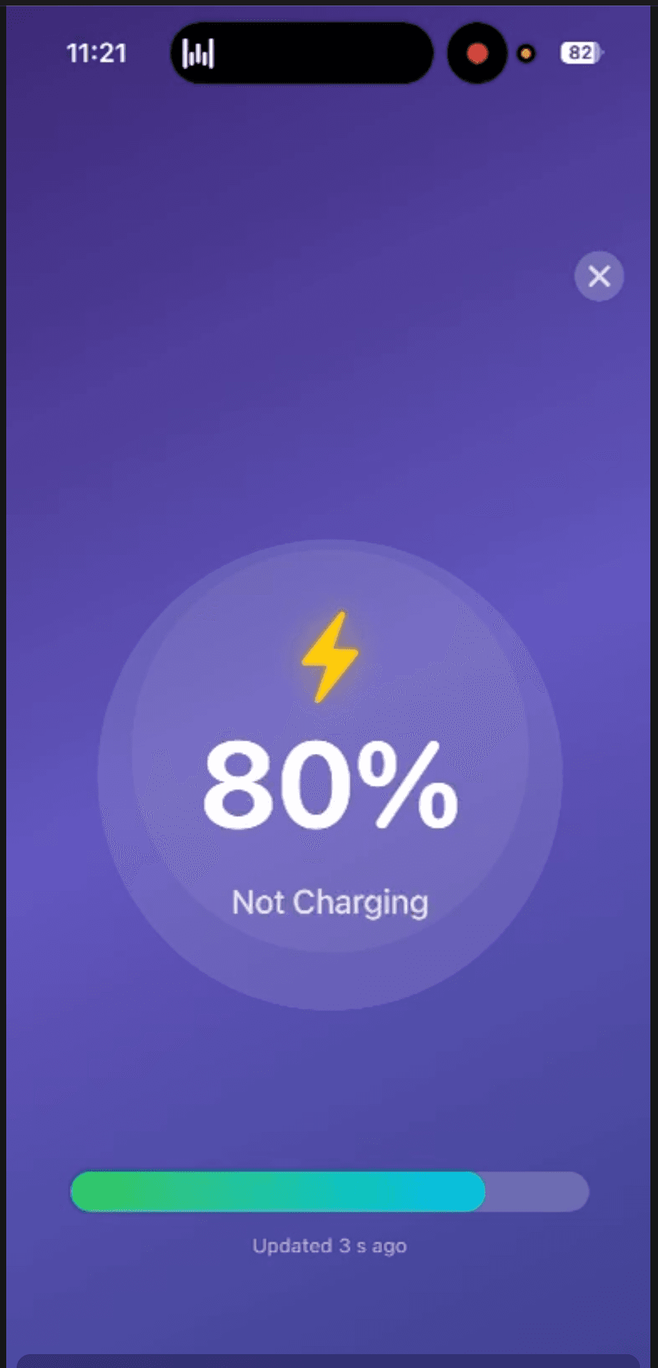
"Shows 80% when my phone is at 65%."
"I have to open the app to get it to update."
They were right. And the frustrating part is that it's not really something I can fix with better code.
Here's the technical reality: Apple gives you two ways to update a Live Activity. The first is background refresh, where the system decides when your app gets to run. This happens somewhere between every 15 and 30 minutes, and it's never guaranteed. Apple throttles this deliberately—imagine if every app on your phone was constantly running in the background. Your battery would be dead by lunch. So apps compete for these background slots, and sometimes yours just doesn't get picked.
The second option is server-side push notifications. Technically possible, but when I looked into it seriously, the trade-offs didn't make sense. You need infrastructure, which means ongoing costs. Those costs would eventually affect pricing, and I want the app to stay accessible. It's also heavier on battery consumption, which feels wrong for a battery monitoring app. And it requires users to have an internet connection for something that should work entirely offline—checking local battery levels between two devices you own. I haven't completely ruled it out for the future, but when I weighed everything, it just wasn't the right path.
So I was stuck with background refresh. Which meant Live Activities that updated every 20 minutes at best, showing rounded percentages that might be 5% off from reality. (That rounding, by the way, is another Apple constraint introduced in iOS 17—all battery apps deal with this now, not just mine.)
Down the Rabbit Holes
I've revisited this problem many times. It's been genuinely frustrating. This isn't my full-time job—if it were, maybe I would have found other solutions by now. But realistically, there's only so much I can do with limited time. I try to weigh effort against impact and focus on where I can get the most with the least. Still, I went down plenty of rabbit holes that led nowhere. Background task optimizations. Different scheduling approaches. Nothing changed the fundamental constraint.
One day I was walking in the park, reading through reviews on my phone, and it hit me.
Someone was complaining that you had to open the app to get an accurate update. My first reaction was defensive—"well, that's Apple's limitation, not mine." But something about the phrasing stuck with me.
The app needs to be open.
I'd always thought of this as the problem. What's the point of a battery monitoring app if you need to pick up your phone anyway? But the framing flipped. What if there was a reason to have the phone on? What if keeping the screen active wasn't a workaround, but a feature?
The day before, I'd been looking at other battery apps, and I'd noticed some had charging animations. People seemed to like them. At the time I'd filed it away as "nice to have someday." But now it clicked: charging animations require the screen to be on. And when the screen is on, the app can update Live Activities in real time.
I went home and built a prototype that night. A pulsing lightning bolt, a percentage, some colors moving around. Nothing pretty—genuinely janky. But I tested it, and it worked. The Live Activity updated immediately. Not in 20 minutes. Not rounded weirdly. Actually live.
Enter Yugi
This is where Yugi comes in, and I really need to thank him properly.
Yugi is a designer I've known since we worked together at a previous job. A while back, we collaborated on a Japanese translator app—he did all the design, I did all the development. Since then we've become friends who help each other with projects. He's been contributing to Unplugged's visual direction for a while now, and honestly, the app looks the way it does largely because of him.
I sent him a TestFlight build of my janky prototype. "Is there any way we can make this beautiful?"
He came back with something I didn't expect. Instead of just polishing my pulsing bolt, he'd been inspired by how iOS handles wallpaper previews—you know, when you force-press on your home screen and can swipe through different color options. He took that interaction pattern and applied it to charging animations. Smooth color transitions, multiple themes to choose from, something that felt native to iOS but also distinctly its own thing.
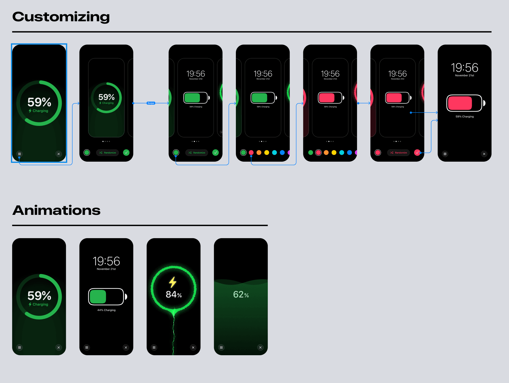
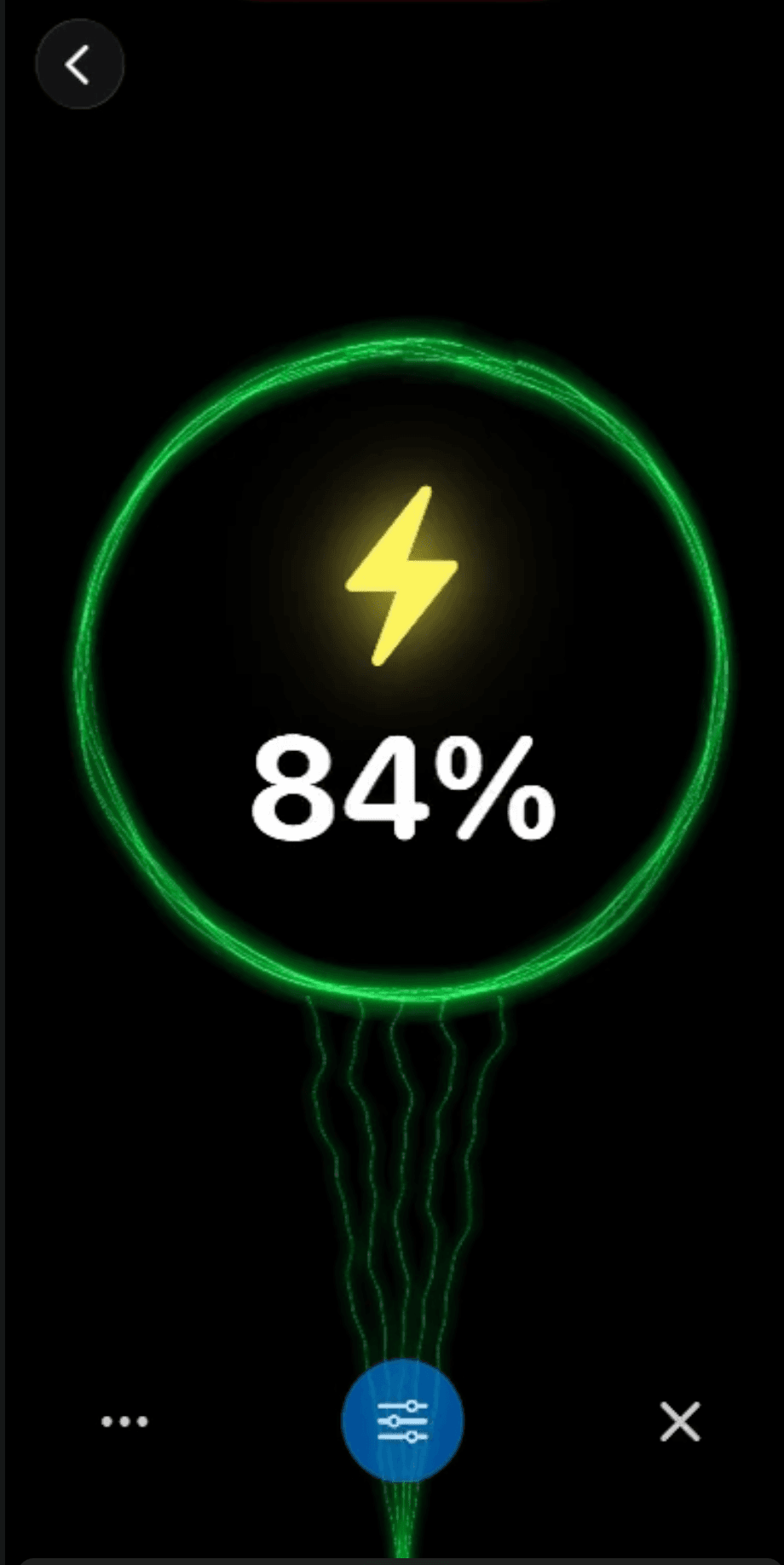
We went back and forth over the next few days. I'd implement his designs, hit technical constraints, he'd adjust. It was fun for both of us—he told me he got to experiment with something really different from what he usually builds, and I got to dive deep into animation techniques I'd never touched before. The first animation I built ended up being the most complicated one—particles, gradients, timing curves—but also the most satisfying when I finally got it working. Having a reason to go deep on something made all the difference. It's the kind of work I'm looking forward to doing more of, if people actually end up caring about this feature.
The Accidental Solution
What's interesting is how this unfolded. I set out to fix Live Activities. I ended up creating a charging animation feature that happened to fix Live Activities as a side effect.
And now users have options. You can still use Live Activities the old way—background updates, 20-minute intervals, all the limitations. Or you can trigger a charging animation when you plug in, and while your phone is charging with that animation running, the Live Activity updates in real time. Or you can just use the charging animations on their own, without Live Activities at all, because honestly they're kind of fun to watch.
The percentage rounding is still there, unfortunately. That's baked into iOS at this point and affects every battery app equally. Apple used to give developers access to exact percentages, so who knows—maybe they'll bring it back someday. Until then, it's something I've been thinking about. Maybe there's a way to turn that limitation into an opportunity somehow, though nothing's come to mind yet.
Rethinking Limitations
I think the real learning for me here is about how to look at limitations.
Some constraints are just hard walls. They block you, and all you can do is accept them or find a workaround. But this experience made me realize that sometimes the limitation itself can become the feature. I wasn't going to beat Apple's background refresh restrictions—but I could use the constraint ("the app needs to be open") as the foundation for something new.
I don't know if that translates to other problems I'll face. Maybe it's just this specific situation. But it's something I'm going to keep in mind going forward. Instead of always asking "how do I work around this," maybe sometimes the better question is "how do I use this."
There's definitely more we could do with animations. These are the first versions, and I'm already thinking about variations. If that's something you'd want to see, let me know—I'd genuinely love to hear what directions feel interesting.
And seriously, thank you to Yugi. The app wouldn't look like this without him. If you like Apple-native design and want to learn Japanese, check out the translator app we built together—you'll feel right at home.
Version 3.5 is live now. If you try the charging animations, I'd love to hear what you think—feel free to reach out.
Written by Christian Skorobogatow
New features. No spam.
Get notified about new releases and behind-the-scenes updates. Unsubscribe anytime.