4.1 Is What 4.0 Should Have Been
Unplugged 4.1 is out now. The iPhone Duo arrives on October 23, and the app is ready for it. But you don't need a foldable for the best part of this update. It's on your iPhone today.
Honestly, 4.1 is everything 4.0 wasn't. Not because 4.0 was bad, but because of time. I like to ship alongside the new iOS releases and use the newest things they bring, so 4.0 came out right when the new iPhones did. And as usual, my eyes were bigger than my stomach. There was a lot more I wanted to do than I could fit in.
Siri was the start
This year, Siri was the big theme. People had been asking for better Siri support for a long time, and Siri itself had gotten a lot better, so it felt like the right moment to push through it. It helps people discover what the app can do, and I think it genuinely makes the core experience better.
But there was a catch. Unplugged has a couple of experiences I'm really proud of, like the charging animation and the Live Activity. Almost all of them needed you to do something to start them. You had to remember. And I get it, because I forget too. Remembering things is hard.
Things that happen on their own
That's where shortcuts clicked for me. I don't use that many shortcuts myself, but the few I do use are the automations, the ones that just do something without you thinking about it. That's how I want Unplugged to feel. An app that does a lot for you, doesn't bother you unless you want it to, and only shows up when you actually need it.
The problem was that shortcuts already existed in 4.0, but setting them up isn't easy. There's a whole learning curve, and most people shouldn't have to learn it unless they want to.
So 4.1 makes it approachable. There's now one Unplugged shortcut that you set up from inside the app, during onboarding or later in Settings. Plug in your phone, and the charging animation and the Live Activity start on their own. Unplug it, and both go away.
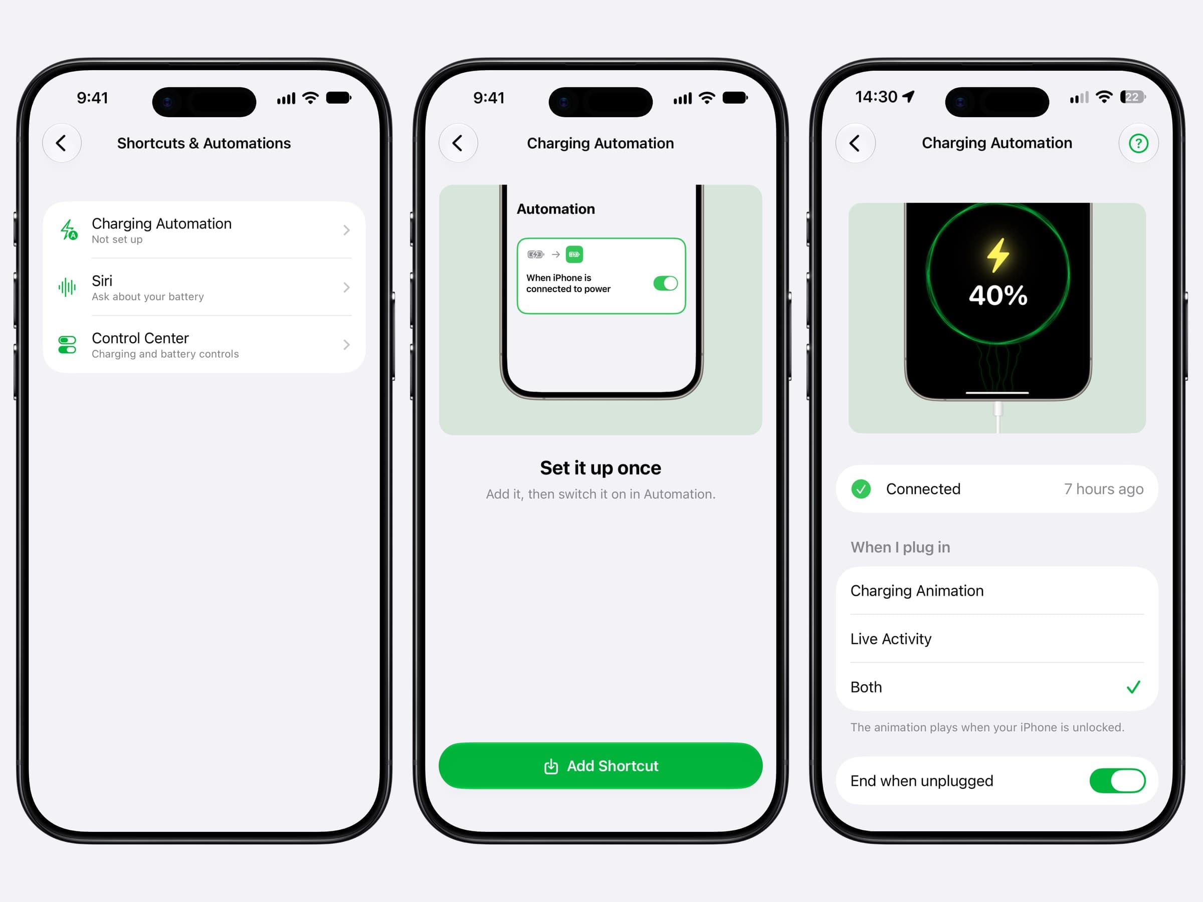
If you love Shortcuts, nothing changes. All the actions from 4.0 are still there, and you can build whatever you like. That probably makes you a power user. If you just want things simple, the one shortcut does the job.
There's one thing I wish I could change: iOS only runs the automation once your phone is unlocked. It's a system restriction, so there's nothing I can do about it from the app.
Why the combo matters
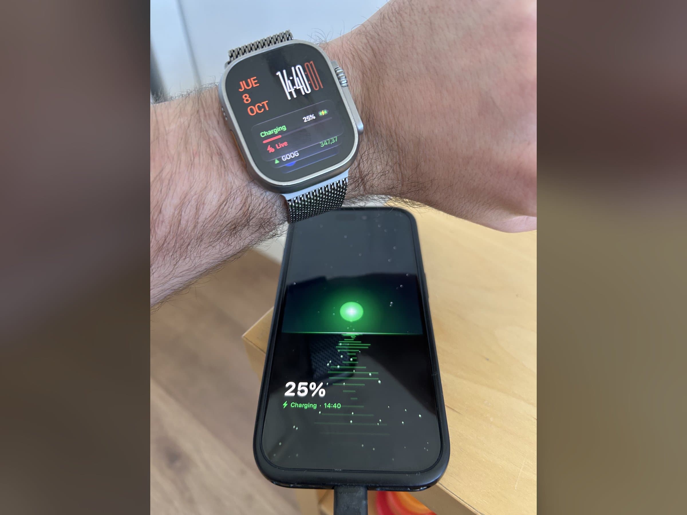
Unplugged shines most, I think, when you use the charging animation together with the Live Activity. You can also use the Live Activity on its own, or just the complication on your watch. But the combo is what I use, and with the automation it's now seamless.
Here's something I'm not sure people know. While that charging animation is running, the Live Activity is actually live. That's rare. Keeping things up to date while the phone is locked, like complications, is the hardest part of what I do. iOS limits how often apps can refresh in the background, and for good reason. If every app refreshed all the time, your battery would be gone by lunch. But those limits do shape how current the number I can show you is.
During a charging session, though, it's the real thing. The only catch is that iOS reports the battery in whole percents, so it moves one step at a time, 62, 63, and so on. I'll take it.
So when I glance at my watch with this running, I know exactly where my battery is. If I want to grab my phone and go, I know how much I'll have, or that it's topped off exactly where I want it. I unplug, the animation disappears, the Live Activity ends. It's an experience I've been chasing for a long time, and it finally feels done.
iPhone Duo
And then, of course, the iPhone Duo. I'm a tech geek. My first iPhone was a 3GS, and it's always exciting when a new kind of device comes along. I've wanted to make apps for as long as I can remember, but I've only been doing it for about six years. This is one of the first times something genuinely new shows up and I actually have the experience to play with it from day one.
I care about this more than I probably should. I used to play a lot of TFT on my iPad, and for the longest time it was just a scaled-up iPhone game with black bars around it. I loved playing it there, but it always felt a bit off, and it took forever to get fixed. I never understood why. So I wanted to lead by example and have Unplugged ready on day one. It is.
It turned out to be a much more interesting challenge than "make everything bigger". Folded, the screen is fairly narrow, and the tab bar takes up a lot of the width, so everything has to squeeze together. Unfolded, the obvious move is to scale everything up, but there's a limit. Past a point, things just look weird.
What worked better was showing more. I took what I'd built for the folded screen and gave it twice the room, so you can see more of the dashboard at a glance without scrolling. Less friction, more to see.
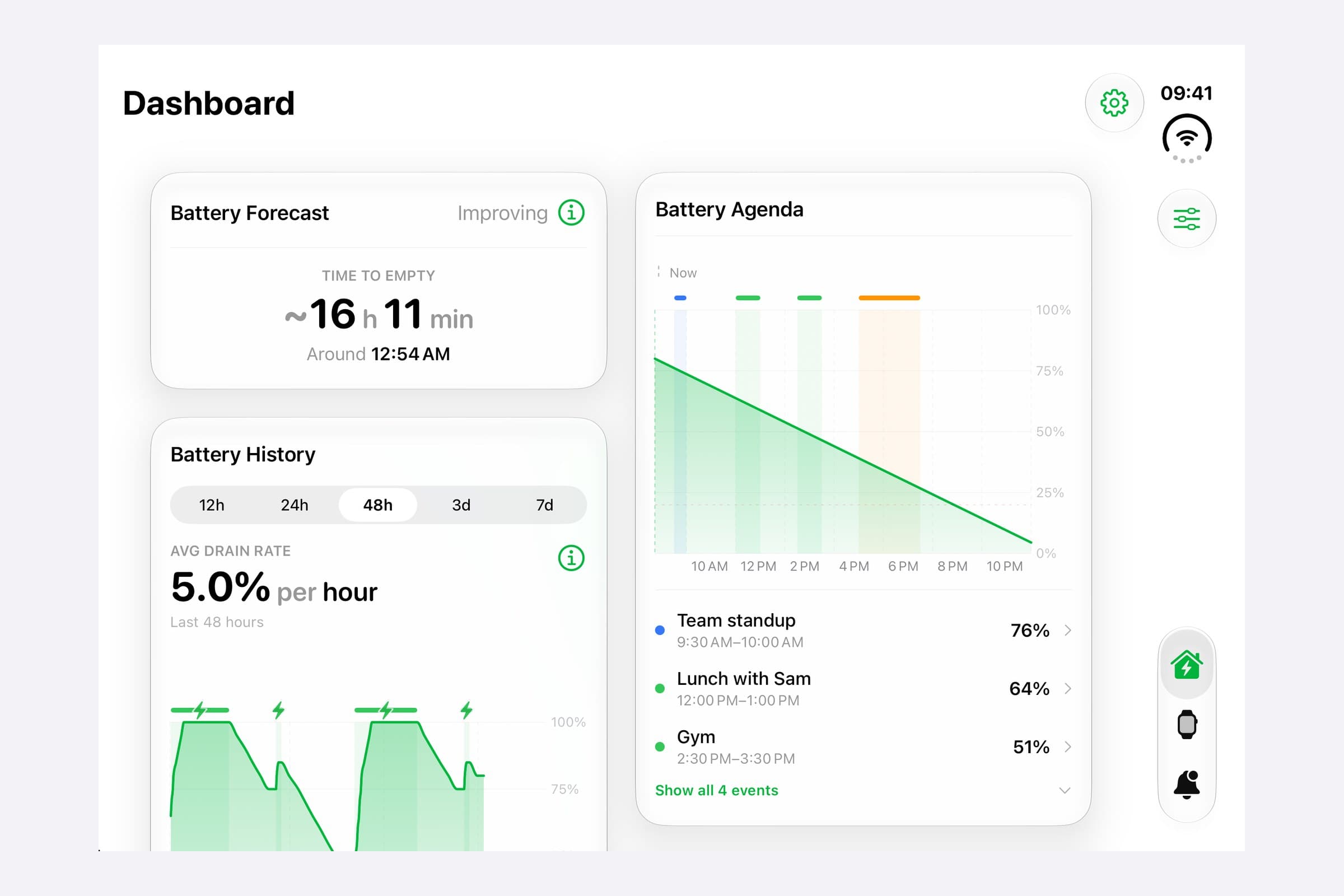
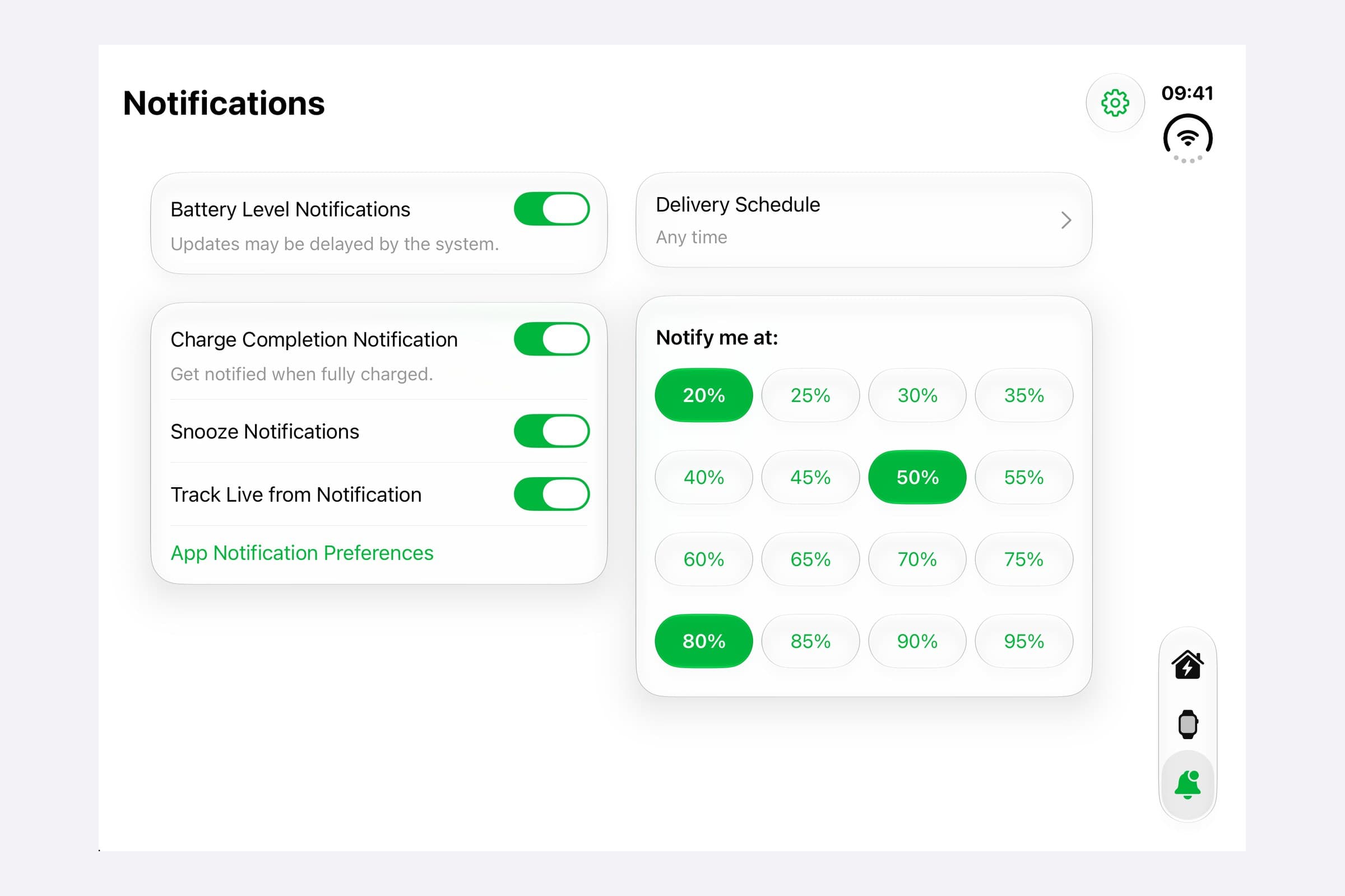
In landscape I wanted the opposite, bigger things, which I was losing. So I went for something closer to a desktop layout. Portrait shows everything larger, like on the folded phone, with bigger graphs for your battery history and forecast. Landscape is for when you want to see more at once.
Horizon
Adapting the layout is nice, but I also wanted to make something fun that actually uses the fold. In the iPhone Duo showcase videos, I loved how Netflix uses the half-folded position. That stuck with me. The fold is a line across the screen, and I wanted to use that line for some kind of artwork.
That's where Horizon came from. It's a new charging animation where your battery level is a sun rising over water. Below the horizon at zero, high in the sky at a full charge. While you charge, little specks of light drift across the screen into the sun. Folded, you see a slice of the scene. Unfolded, you see more of the same panorama instead of a stretched picture. And half-folded, the horizon sits right on the fold, and the sun rises out of it.
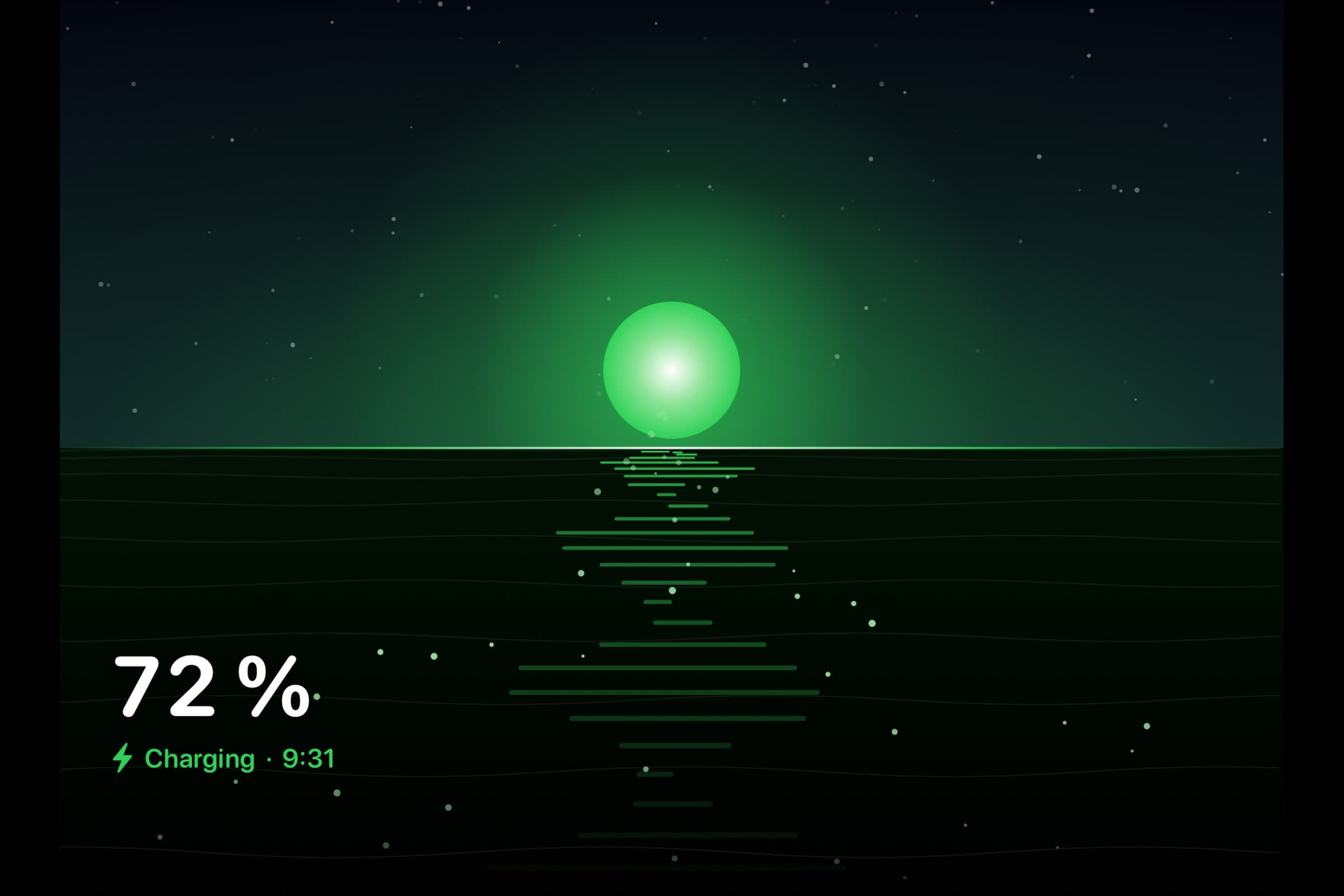
For a first attempt, I think it's in a cool spot. There's plenty to improve, and there are more animations and ideas I'd love to try, because this is a really rich new platform. Horizon also works on every other iPhone, and all the existing charging styles now fill the Duo's screens properly too.
As for me, I've been saving for a while, and I'm upgrading from my iPhone 14 Pro on day one. I know it's very expensive. I keep telling myself it's justified because I'm an iOS developer. I just hope it lives up to my expectations and feels worth it.
Why this matters to me
Here's the honest part, and it picks up where the last post left off. It's hard to stop myself from building the things I love, because they don't always move the needle. And I really need Unplugged to grow, to justify the time I put into it.
I have a lot of love for this app, and for battery as a problem. Every device has one, and it's a daily reality you have to deal with. If you have plenty of charge left, maybe it's not a problem today. But sooner or later, you always have to charge. There are so many ways to make that easier: when you charge, when you unplug, when and how you get told about it, and plenty of ideas I haven't even gotten to yet. That's what makes it so interesting to me.
I hope that with the charging animations and the automation, more people use them. If they do, I can justify spending more time on them. And if enough people use Unplugged and pay for it, this would be a super cool thing to work on full time.
If you like the app, the thing that helps the most, even if you never pay for it, is leaving a review on the App Store. It's a crowded place, and reviews are a big part of what helps an app get seen. It makes a bigger difference than you'd think.
And if you try the automation or Horizon, I'd love to hear what you think. You can find the app on X at @Unplugged_App, or me at @chris_iosdev.
Written by Christian Skorobogatow
New features. No spam.
Get notified about new releases and behind-the-scenes updates. Unsubscribe anytime.